Code
# Access custom defined functions
targets::tar_source("../R_functions")# Access custom defined functions
targets::tar_source("../R_functions")make_plotdata_movement_matrix() |>
plot_matrix_movement() +
scale_fill_mpxnyc(name = "From Borough", option = "dark") +
scale_color_mpxnyc(name = "To Borough", option = "dark") +
scale_size_mpxnyc() +
theme_mpxnyc_matrix_movement() 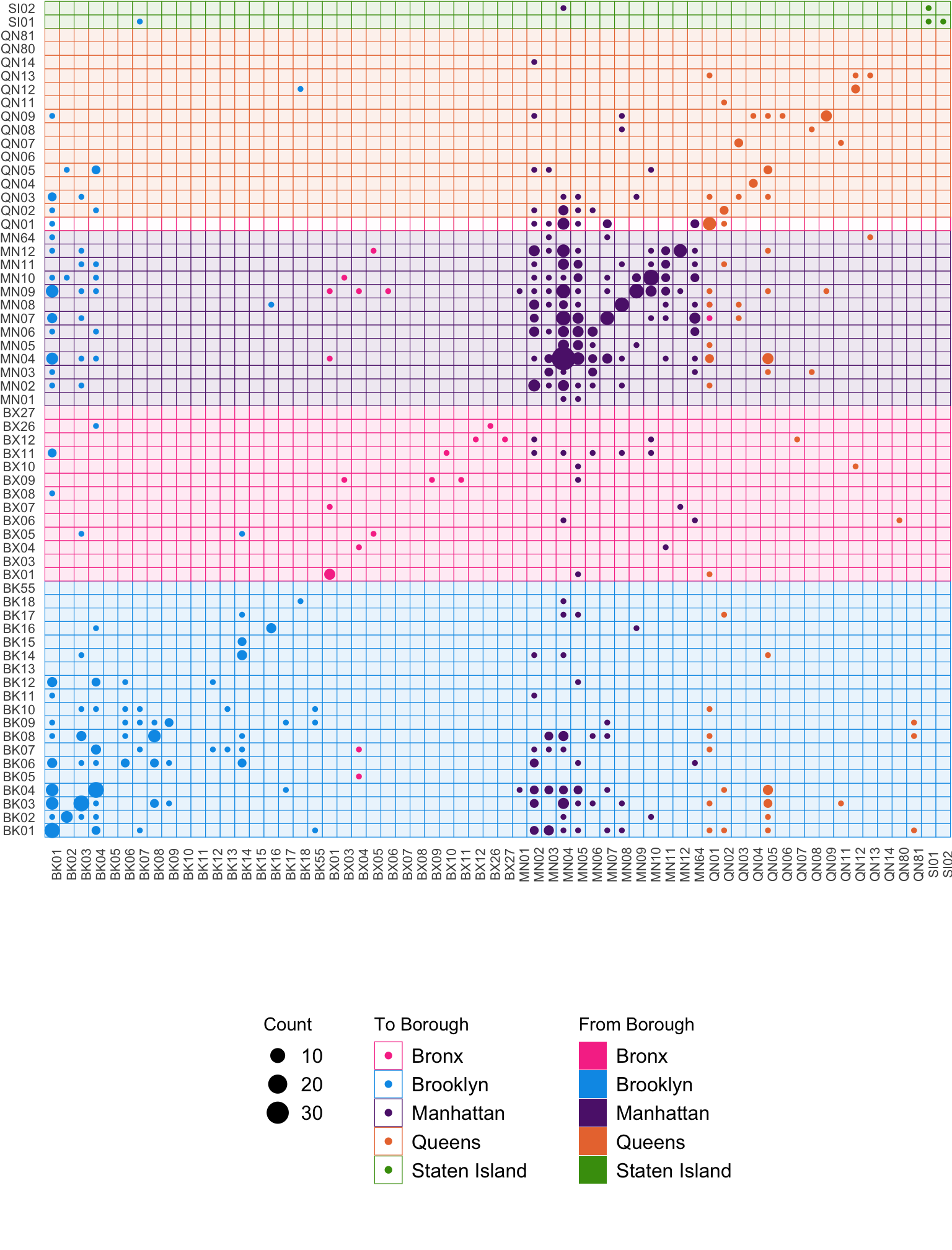
MPX NYC participants’ movement patterns reveal how social life—and likely the outbreak itself—traversed New York’s neighborhoods. Using participants’ home and contact venues, we visualized how gatherings connected community districts across boroughs.
Figure 8.1 maps each gathering’s community district (x-axis) against the participant’s home community district (y-axis). Dots along the diagonal show that much movement occurred within the same community district, while off-diagonal clusters show inter-district travel. Four distinct clusters stand out: one within Brooklyn (pink), one within Manhattan (purple), and two representing cross-borough movement between Brooklyn and Manhattan. Together, these illustrate how interconnected queer nightlife and social spaces were—locally dense, yet city-wide in reach.
Figure 8.2 compares the share of primary residences and gatherings across community districts. Within each borough, a few districts were over-represented among gatherings relative to where participants lived—specifically BK01 (Williamsburg–Greenpoint), MN04 (Chelsea-Hudson Yards), and QN05 (Ridgewood). These places mark the city’s social centers: where people converged for nightlife, group gatherings, and sexual contact, amplifying both community connection and opportunities for transmission.
make_plotdata_spatial_concentration_bar() |>
  plot_home_vs_residence_dbn_bar() +
  scale_alpha_mpxnyc() +
  scale_fill_mpxnyc(name = "Borough", option = "dark") +
  scale_axis_mpxnyc() +
theme_mpxnyc_home_vs_place() 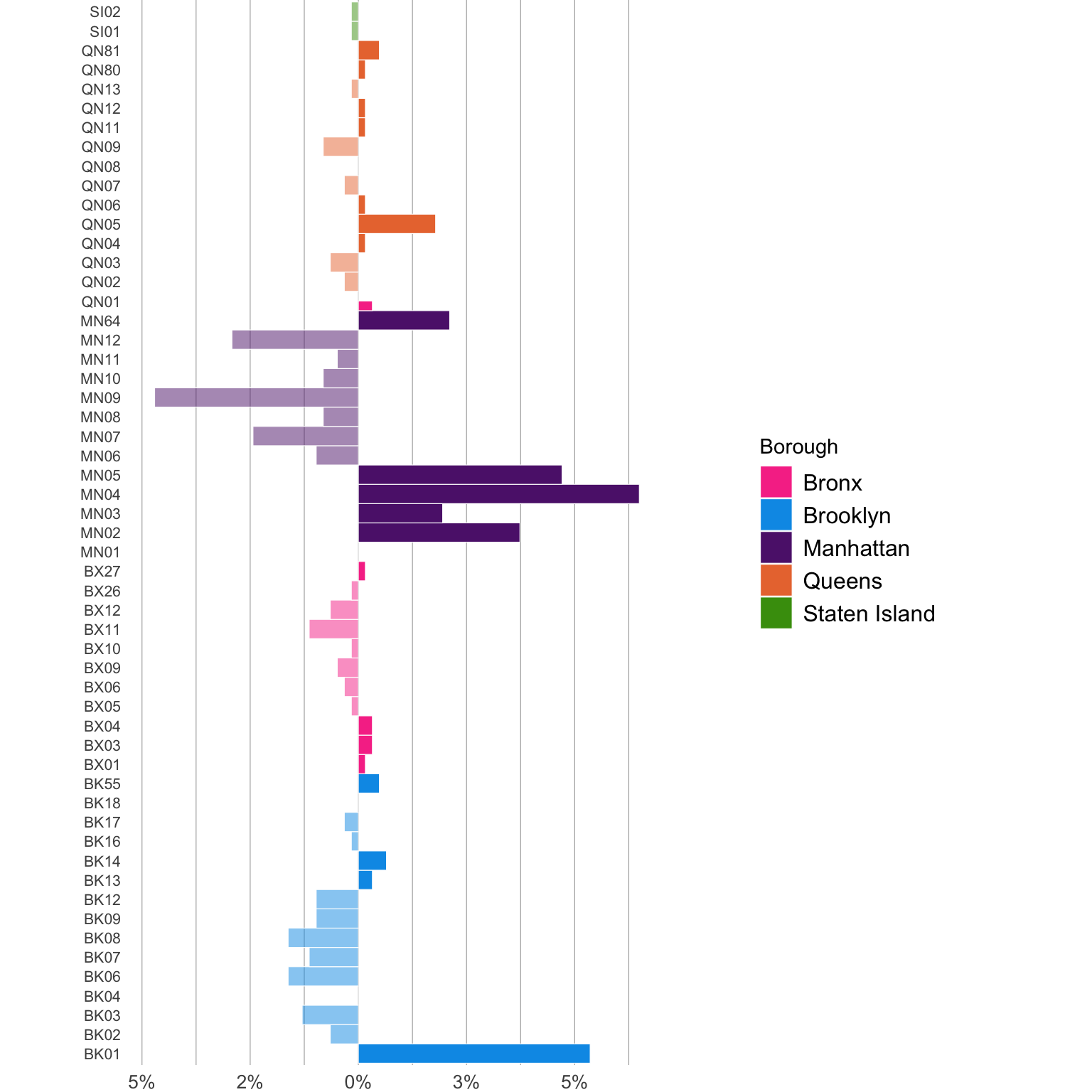
plot_icon(icon_name = "eggplant", color = "dark_green", shape = 8)